Thursday, 27 March 2014

Black and White


                                                   Black and White Techniques


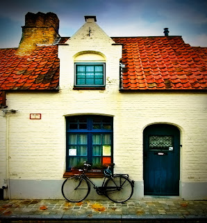
Original Image


Black and White
To get this black and white image you go into adjustment layer and click on black and white. You can then change the shades of colour that was in the image by moving the levers.
This image brings out a lot of detail on the building compared to the original. It gives an historical feel. I like the contrast between the dark sky and the bright building, gives the image effect.

Channel Mixer
To get this black and white image you also have to go into adjustment layer,then click on channel mixer and click the box by monochrome to turn it on. Similar to the black and white technique, you change the shade of colour by moving the levers, so you get the opportunity to create your own black and white image. But you do need to have the total percentage on 100.
I think that this technique makes this image look boring as it is all the same tone of black and white.


Gradient Map
To get this image you go into adjustment layer and click on gradient map and then click inside the colour section. This will then give you a gradient editor which you use the levers on the bottom to change the image.
This image has completely gotten rid of the sky which I like because I want the focal point to be on the building. I also like the detailing you can see in this image.


 Grayscale
To get this image you go into image, mode and then click on grayscale. When the message pops up you choose discard. You are then left with your black and white image.
I think that this is the easiest technique to do as it is very simple, and I also think that it gives you just a basic black and white image.

Hue Saturation
To get this image you go into adjustment layer and go on hue saturation. You move the saturation lever all the way to the left and then click ok. Then you will be left with your black and white image.
Again, this technique is simple and easy to do. I think that it is quite similar to the grayscale technique, however this image is lighter.
 

Lab Colour
To get this image you go into image, mode and then choose lab colour. You then go into channels and click on the box that says 'lightness'. After you've chosen that you go back into image, mode but click on grayscale, press ok to the message that comes up.
I like this image. I think it gives a good historical feel and all the detail in image is there.
 

Thursday, 20 March 2014

Beauty Retouching


Beauty retouching
 
 
Every image that you see in magazines, news papers, adverts or on the internet would have been taken into Photoshop and edited.
 
 
Like this image for example, you can see the before stage and the after stage and there are a lot of changes that have been made.
The first thing that I can see that has been changed, is that some of her hair has been edited out, I guess this was done so it look like the hair is up and is more professional.
Also her face has had a lot of retouching done to it. Her skin looks completely different in the after image. The lighting on her face has been changed and the colour of her lips are more pink. Colour balance could have been used to change these. There are also a few eyebrow hairs that have been edited out, the clone tool could have been used here.
 
I think this image has been manipulated for make up advertisement. I think this because of the way her skin has been perfected so much.


Thursday, 27 February 2014

Flag


For this image, I have changed the sky.

To do this, I chose the channel that had the best contrast between black and white, which was the green channel. I then copied this channel.

I used the dodge tool to colour in the background white. The good thing about the dodge tool is that I could go over the flag and it wouldn't make it white. I then used the burn tool on the flag to make it black.

I then clicked on the RGB channel bar and went back onto layers as I needed to make the image active. I then inversed the image and added a mask.

I then chose an image of the sky that I wanted to use on this image. I dragged the sky image onto the flag image and placed the sky where I wanted it to go. I then clicked the tick at the top. Then in the layers palate I moved the layer underneath the background copy.

Lastly, I changed levels to balance the two images together.

Friday, 31 January 2014

Textures

Textures


This is an image that I created in Photoshop. The inspiration for this image was 'telling a story'.

First of all, I chose a texture that I wanted to use. The texture is blue, green and yellow which you can see in the background. I then chose the girl, as the main character, and put her over the texture but blended her into it. Next, I put the writing over all of it to show the writing in a book. As I still wanted to see the girl, I needed to fade out the writing on her face and hand so she could still be seen. To put an interesting twist to the image (story) I added a red splat to the right corner. This is to show her getting killed at the end of the story!


Border

 Adding a border

The image before.

The image after.

For this image, I added a border.

Flowergirl

Flowergirl

Flowergirl before.


Flower girl after.
Two borders have been added to this picture, a white one and a black one. 

Bikehouse


Bikehouse
  
Bikehouse before.


Bikehouse after.

For this image, I edited the edges darker to make it look more effective.